Kosh with Linda Ronstadt during 1978’s Living in the USA photo shoot (Photo: Kosh Archives; used with permission)
When you’ve designed more than a dozen of Linda Ronstadt’s album covers—including three that earned Grammy Awards for your work—you’re able to share the following: “I had a call from Linda a few days ago. She was checking in on me and sounded great.”
“The thing about Linda,” says John Kosh, her longtime collaborator, and recipient of that phone call, “is she never seemed to really appreciate how good she was.”
But her audience sure did as she evolved musically through a half dozen (or more) genres. And one constant, for a long string of successes, was Kosh. The celebrated designer—everyone just calls him by his last name—had already served as art director for one of the most iconic album covers in music history: The Beatles’ Abbey Road, for which he famously, and riskily at the time, omitted the band’s name from its front side.
Kosh has designed covers and other iconic artworks for a literal who’s-who of recording artists, including, just for starters, Eagles’ Hotel California, The Who’s Who’s Next, the ELO logo, John and Yoko’s “War is Over” campaign, and covers for James Taylor, Ringo, Rod Stewart and Bad Company, among his scores of projects.
In 1975, Kosh, recently transplanted from London to Los Angeles, got a call from his friend, Peter Asher. “He said, ‘I’ve got a really great artist that you should meet,'” Kosh recalls. “I had never heard a voice like hers.” He was referring, of course, to Ronstadt, whom Asher managed and produced.
The singer was beginning her longtime association with Elektra/Asylum when Asher set up their first meeting. “I was a little bit nervous,” Kosh says, “but she was enthusiastic because I came in with this reputation, having worked with the Beatles.”
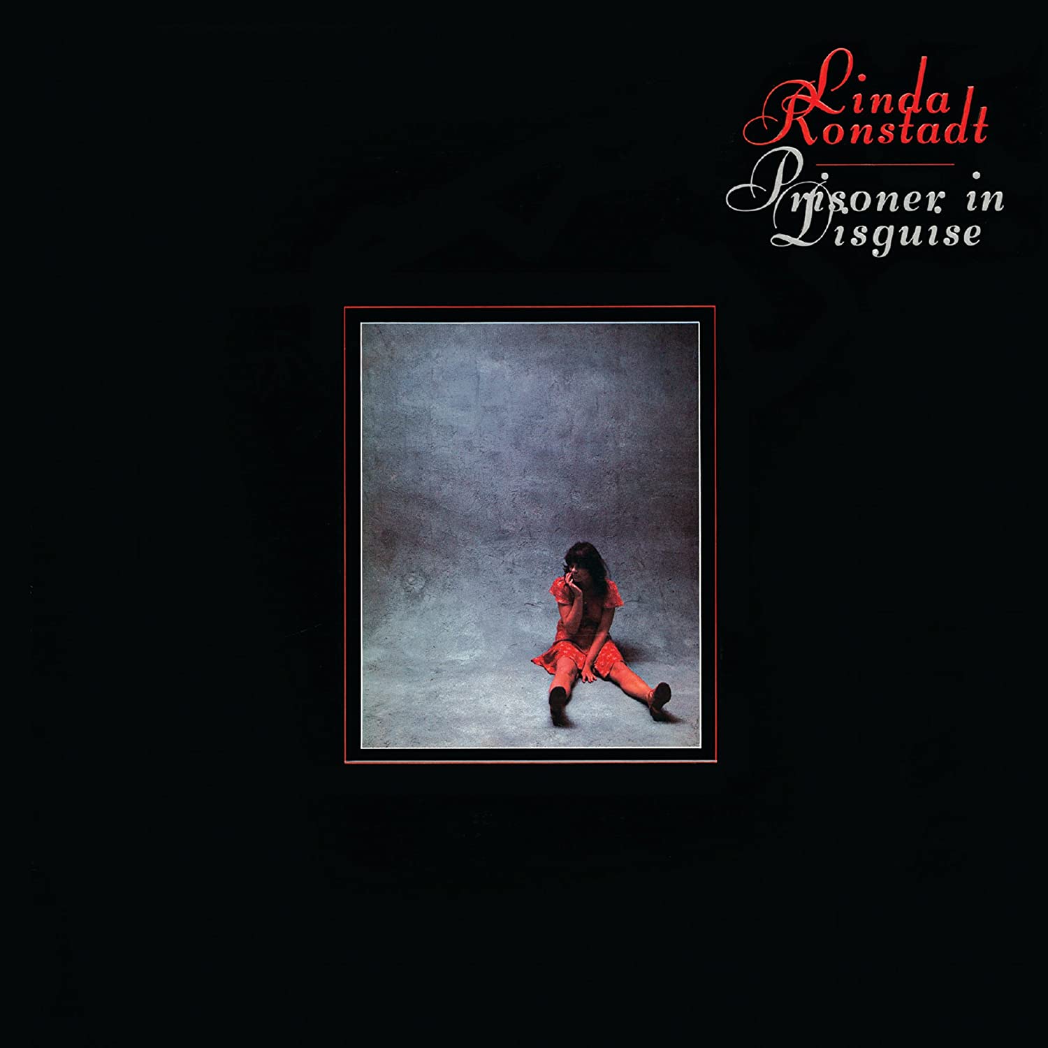
Their first collaboration was for Prisoner in Disguise, which included her classic renditions of “The Tracks of My Tears,” “Love is a Rose” and the album’s biggest single (and concert crowd-pleaser), “Heat Wave.” The front cover is a small, framed photo of Ronstadt, born on July 15, 1946, and who had just turned 29.
“She’s being imprisoned in that photograph,” says Kosh. “You can turn it over and you’ll get your money’s worth,” he says of the full-size headshot on the back. (Ethan Russell, with whom Kosh had collaborated on the Beatles’ Let It Be and on The Who’s Who’s Next, took both shots.)
For the gatefold, Kosh and Asher persuaded the songwriters—Smokey Robinson, Neil Young, James Taylor and Dolly Parton, among them—to handwrite the lyrics to their songs.
“I’m being hired, more or less, to be the conductor of an orchestra to work with the photographer, all the way from the initial meeting, to getting concepts organized, getting it finalized,” says Kosh. “I make the point of gaining the trust of that artist and I want to get in the studio while they’re [working] so I can listen to a few tracks. But what I really want to do is sit down with the artist and just enjoy bouncing ideas back and forth.”
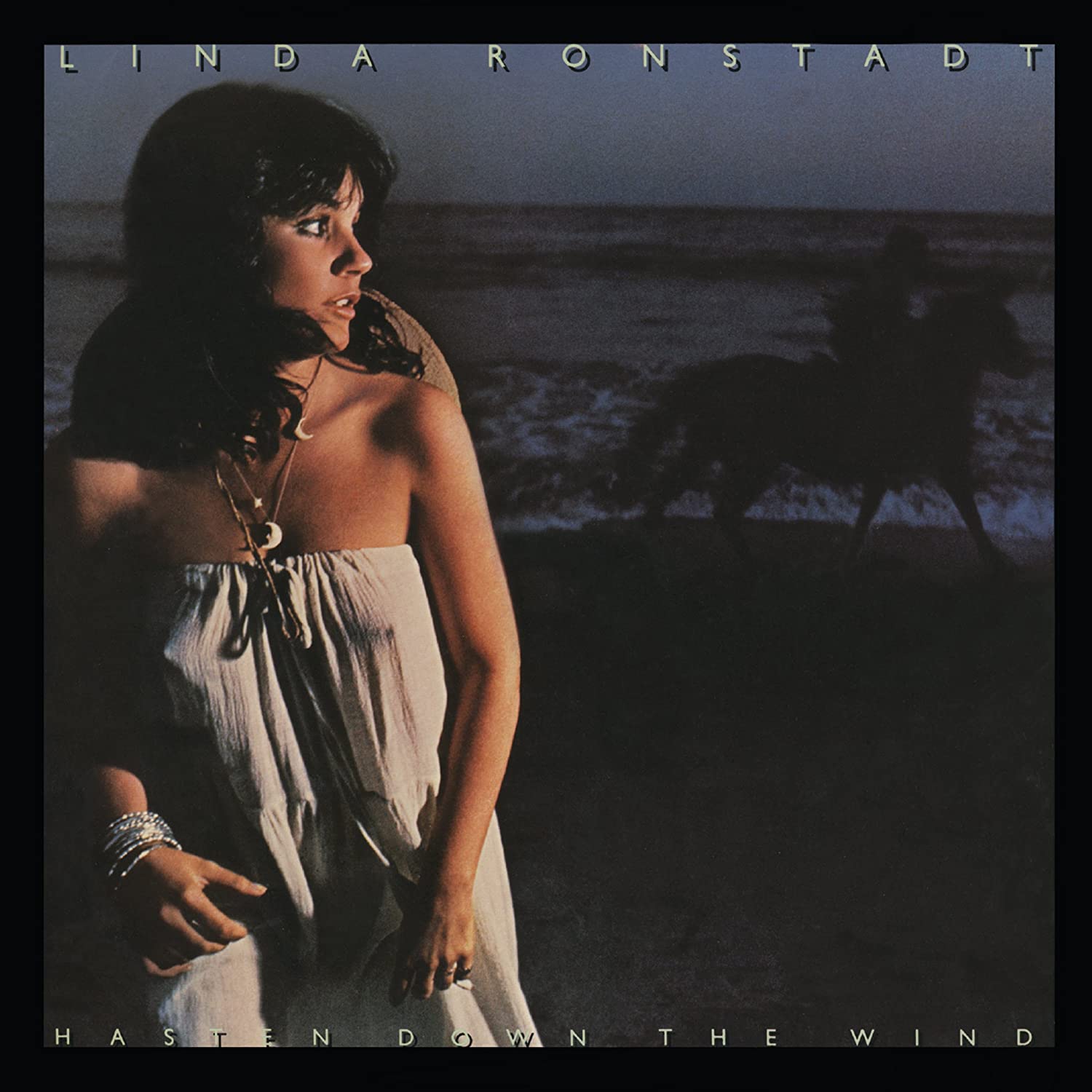
The designer and singer got along so well, it led to a follow-up, one year later… and a bit of controversy. Kosh, photographer Ethan Russell and their crew set up a shoot in Malibu on the beach. (“It took hours to organize.”) The photo chosen for what would become the cover of 1976’s Hasten Down the Wind was shot at night. “There was a time exposure on the background and then we add a flash… a strobe on Linda. That freezes her in the frame just as a horse is riding past. Even when she was posing, she wasn’t posing.”
You don’t need to look too closely to see Ronstadt’s nipples peeking through her shirt. Kosh can laugh now but at the time, he says, “It caused a ruckus. People asked, ‘Are we selling music or sex?’”
The album, with her great version of “That’ll Be the Day,” became her third straight to sell over a million copies, a record at the time.
Related: Our Album Rewind of Hasten Down the Wind
With 1977’s Simple Dreams, Ronstadt became as big a music star as there was. It spent five weeks at #1 thanks to a boatload of radio hits, delivering two perfect ballads (“Blue Bayou,” which was nominated for Record of the Year, and “Tumbling Dice”) and two superb uptempo numbers (“It’s So Easy” and “Poor Poor Pitiful Me”).
The inner gatefold is meant to look like a backstage shot, although it was taken in a Hollywood studio. “The front and back cover shot was very difficult to light,” recalls Kosh. “Can you imagine keeping photographer Jim Shea and the assistants out of the shot, with all those mirrors around?” Kosh shares that the shot that used was actually from a second shoot. Recalling the flak they had received with the Hasten Down the Wind cover, the Elektra/Asylum brass had objected to the original pictures with Ronstadt in a skimpier outfit.
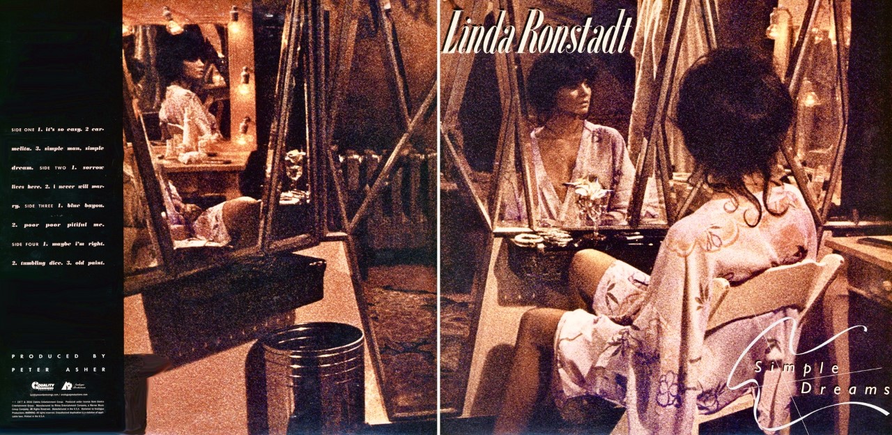
Of 1977’s Simple Dreams, Kosh asks, “Can you imagine keeping photographer Jim Shea and the assistants out of the shot, with all those mirrors around?”
“We had to re-shoot the whole thing,” says Kosh, recalling the complicated rigging involved.
It paid off. Simple Dreams sold more than three million copies, her most up until that time. Kosh earned a Grammy for Best Recording Package. Kosh says, “She was her own biggest critic, she rarely showed off. Except for ‘Blue Bayou,’ and then she really let go.” (laughs)
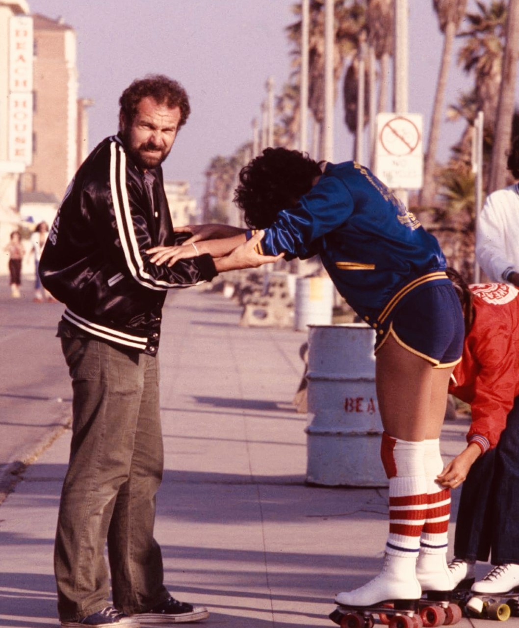
Snapshot: Of 1978’s Living in the USA, yet another #1 album, Ronstadt is on roller skates. [See photo at the top.] Kosh says, “We were all flying high, living in L.A. I was still here on a green card so living in the U.S.A. was still tenuous for me.”

At the dawn of a new decade, Ronstadt was recording the album that became Mad Love.
“We were looking to do a film noir sort of thing. Linda had suggested she should have a strong look to match the hard drive of the music. We scouted and rehearsed it and got the lighting right and then, when Linda arrived, we went to work on her hair and make-up before she jumped into the booth.”
The cover is one of Kosh’s favorites. “We took her as far as we could to make her look both punk and glamorous. In Peter Howe’s photo, she’s sitting in the phone booth and she’s actually calling her boyfriend, who happened to be the governor of California.”
The album, yet another platinum success, included two more Top 10 singles, “How Do I Make You” and “Hurt So Bad,” as well as “I Can’t Let Go,” which Ronstadt belts with gusto.
Ronstadt spent the next year or so embracing another genre when she acted in the stage production of the Gilbert and Sullivan comic opera, The Pirates of Penzance.
Her next release was 1982’s Get Closer and while it was well received, it had no radio hits. For the cover, an image taken by Aaron Rappaport of Ronstadt in a red dress with white polka dots, is juxtaposed against a reverse of that pattern.
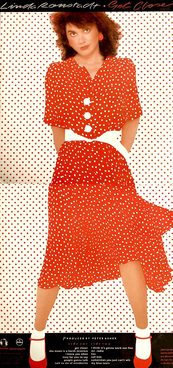
Kosh calls it “a bit of a tour de force in terms of the graphics and getting out the creases from the dress, and the right metallic inks.” It earned him a second Grammy Award for Best Album Package.
The dress she’s wearing was Kosh’s wife, Marjory’s. “A few weeks later we’re at a concert with Linda, and Marj says to me, ‘Hey, she’s still wearing my dress!’”
Related: Our interview with Peter Asher about Ronstadt
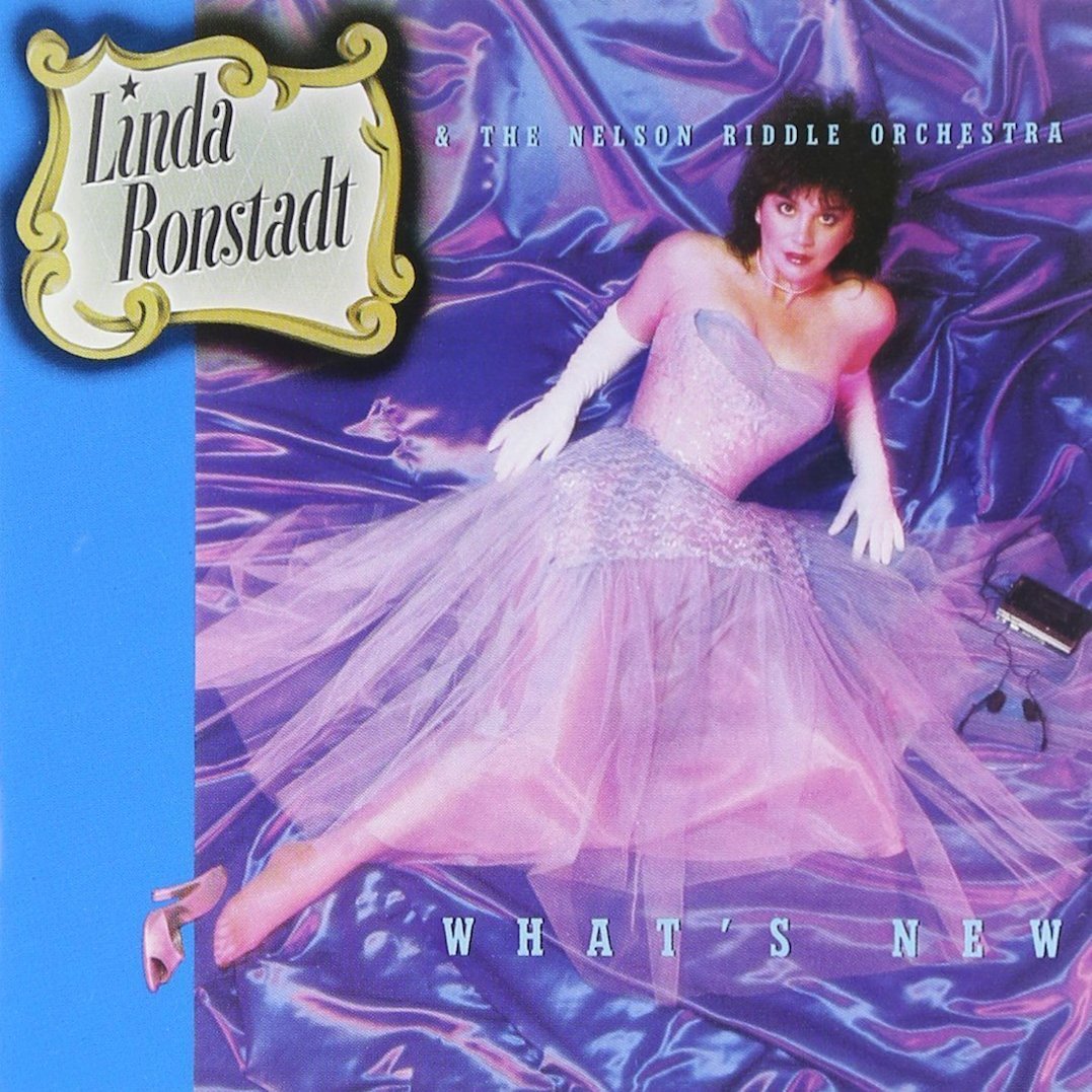
With her next move, Ronstadt stunned the music industry and her audience by releasing What’s New, an album devoted to traditional pop standards, recorded with legendary arranger and bandleader Nelson Riddle. The 1983 title, with Ronstadt’s takes on such Gershwin classics as “I’ve Got a Crush on You” and “Someone to Watch Over Me” and Irving Berlin’s “What’ll I Do,” was a surprise hit to everyone—the label included—and ultimately paved the way for other stars to take on the Great American Songbook.
Kosh delights in sharing “the little joke,” that he calls it, about the cover. There’s Linda, still just 37 years old in the Brian Aris photo, lying on a bed of satin in a prom dress, and just to her left is a Sony Walkman, the latest electronic gadget of the day.
What’s New sold a stunning three million copies. Its success led to two follow-ups, both of which Kosh designed.
The first, 1984’s Lush Life, earned Kosh his third Grammy. Ronstadt isn’t on its cover. The designer is asked if the label pushed back on that decision.
“No, Peter Asher and I had a lot of clout—I was also working with the Eagles at the time. As an outside art director, I’m a bridge between the artist and the record label. We didn’t put her face on the cover because it didn’t seem necessary. We had a different audience… the ones who wanted to hear the torch songs. It broke the rules.”
In 1987, a dozen years after their first collaboration, Ronstadt made another significant “about face” with her choice of repertoire.
Born in Tuscon, Ariz., on July 15, 1946, Ronstadt is actually of Mexican descent on her father’s side. She chose to record an album, Canciones de Mi Padre (Songs of My Father), to celebrate the family’s musical roots.

For the cover, she’s wearing a flowing dress in Bob Blakeman’s photo, with the back cover featuring her father’s painting. “It’s a very personal album cover,” says Kosh, “very ethnic looking. She’s got those gorgeous brown eyes, and looks very innocent. It was my gift to her.”
Though the album peaked at just #42 on the Billboard chart, it was nonetheless a significant seller, certified double platinum, and is listed as the top-selling non-English album in U.S. history.
All these years later, Kosh is asked about his longtime friend. “She’s the most fascinating woman, along with my late wives, that I’ve ever known.
“She was just the sweetest and loveliest client. And she’s still my pal.”
Ronstadt’s recordings are available in the U.S. here, in Canada here and in the U.K. here.
Related: Kosh talks about some of his iconic covers for other stars


4 Comments so far
Jump into a conversationYou tell us that Kosh designed the cover for Abbey Road, “for which he famously, and riskily at the time, omitted the band’s name from its front side.”
The band’s name was omitted from the front covers of Rubber Soul and Revolver, both released before Abbey Road. His decision was nothing like risky, and has never, ever been famous.
Love that article! Of course. I was most excited about the music. But Linda’s album covers were always thrilling. Thank you John Kosh
Ha, I was in High School in the late 60s & College in the 70s and I Loved Linda, her music & her image. I have the cover of “Hasten Down The Wind” but not until I read this article did I ever notice that she shared the cover with a horse.
I would’ve liked more info about “Living in the USA’, one of the most iconic albums covers in the history of rock & roll (beats the hell out of “Abbey Road”) which houses a great and underappreciated masterpiece of nocturnal Americana. First LP ever to ship double platinum.