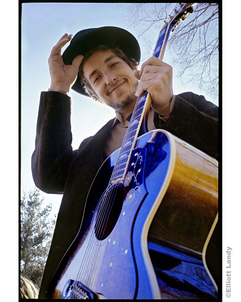
“It was the first picture of him smiling, and in my opinion, reflects the inner spirit, the loving essence of the man behind all the inspiring music he has given us” (Photo © Elliott Landy; used with permission)
For a few years, beginning in the late Sixties, Elliott Landy photographed many of the biggest names in what is now referred to as classic rock. His iconic images of Bob Dylan, Van Morrison and The Band are featured on their album covers and his work has appeared on the covers of numerous magazines, from Rolling Stone to Life to Saturday Evening Post. He was the official photographer of the 1969 Woodstock Music & Arts Festival. Clapton. Hendrix. Baez. The Who. Joplin. In the late Sixties, Landy photographed them and many more.
In his book, Woodstock Vision: The Spirit of a Generation, first published in 1994 and expanded to twice the size in the latest 2009 edition, Landy shares his colorful, first-hand stories of his friendship and collaboration with many of these artists.
His story of how the iconic cover photograph of Bob Dylan’s 1969 album, Nashville Skyline, is one of many that Landy tells in the book. Portions of it are reprinted here, in italics, with his permission, along with my own discussion with the photographer in January 2019 about how the photo came to be.
I moved to Woodstock in 1968. I had fallen in love with the lifestyle there and expected that I would do more work with Dylan and the Band. I used to see Bob occasionally here and there.
In early 1969 he called and asked me to take a picture for the back of his new album, Nashville Skyline. He had the front cover already picked out—a picture of the skyline of Nashville, where he had recorded the album.
By that time in our relationship, we were kind of friendly. I was 26; Bob was 27. I didn’t see him a lot but when we did see each other, there was an ease and a closeness there. When I arrived at his home on Upper Byrdcliffe in Woodstock, he played the album for me and we talked a lot.

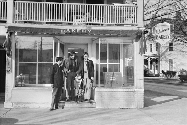
Bob Dylan with his son, Jesse, and friends, Woodstock town square, Woodstock, NY, 1969. (Photo © Elliott Landy; used with permission)
He suggested that we take a picture in front of the bakery in Woodstock with his son, Jesse, and two local Woodstock people. The brown leather jacket he was wearing was the same one he had worn for the cover of John Wesley Harding and Blonde on Blonde. We took some pictures and then went to my house and hung out.
We did another shoot a few days later. I went over to his house late in the afternoon and we hung out for awhile. Whenever I can choose the time of a photo session, I shoot at the end of the day because the light is best—there’s no glare from the sun. You get soft warm colors and gentle black and white shades. In the movie business, they call it “the magic hour.”
So when the light was right we headed out the door. I picked up my camera bag and led the way. He stopped at the coat rack, almost as a second thought and grabbed a hat.
“Do you think we could use this?” I had no idea if it would be good or not, so I told him “take it, and we’ll see.” We walked around through the woods behind his house looking for a good spot. It had just been raining, we had boots on, and he was carrying this hat.
He paused for a moment, apparently inspired, and said, “What about taking one from down there?” pointing to the ground. As I started kneeling, I saw that it was muddy but kept going. “Do you think I should wear this?” he asked, starting to put on his hat, smiling because it was kind of a goof, and he was having fun visualizing himself in this silly-looking traditional hat.
“I don’t know,” I said as I snapped the shutter. It all happened so fast. If I had had any resistance in me, I would have missed the photograph that became the cover of Nashville Skyline.
It is best to be open to life.
I brought the film to the city to be processed and then brought it and a slide projector to his house to show them to him. I brought a 12 x 12 inch white card, which was the size of a record album jacket, so we would see the photos just as they would look on an album—in real size. I projected the slides onto the card, zooming in and out on various images to show how they would look.
I guess there were between 70 and 125 slides. When the one which became the cover appeared, he said, emphatically, “That one!”—his quick recognition of the best photo we had, showing that his artistic abilities were not limited to music.
He was very excited by that one right away. It was the first picture of him smiling, and in my opinion, reflects the inner spirit, the loving essence of the man behind all the inspiring music he has given us. Someone told me that the reason people like it so much is that it makes them happy.
Whenever I work with anyone, and it’s their project, I let it be their decision. I’ll gently say what I feel about the photos, but in this case, it wasn’t necessary.
When the album came out, every review I read talked about how he looked on the album. “Dylan is very happy… he looks great…etc.” They were remarking about the photograph, but not one of the reviews said what a great photograph it was. But for me, that is the definition of a great photograph… that it’s invisible. You’re not supposed to look at it and think, “That’s a great photograph.” You’re supposed to look at it and see and feel what it’s showing.
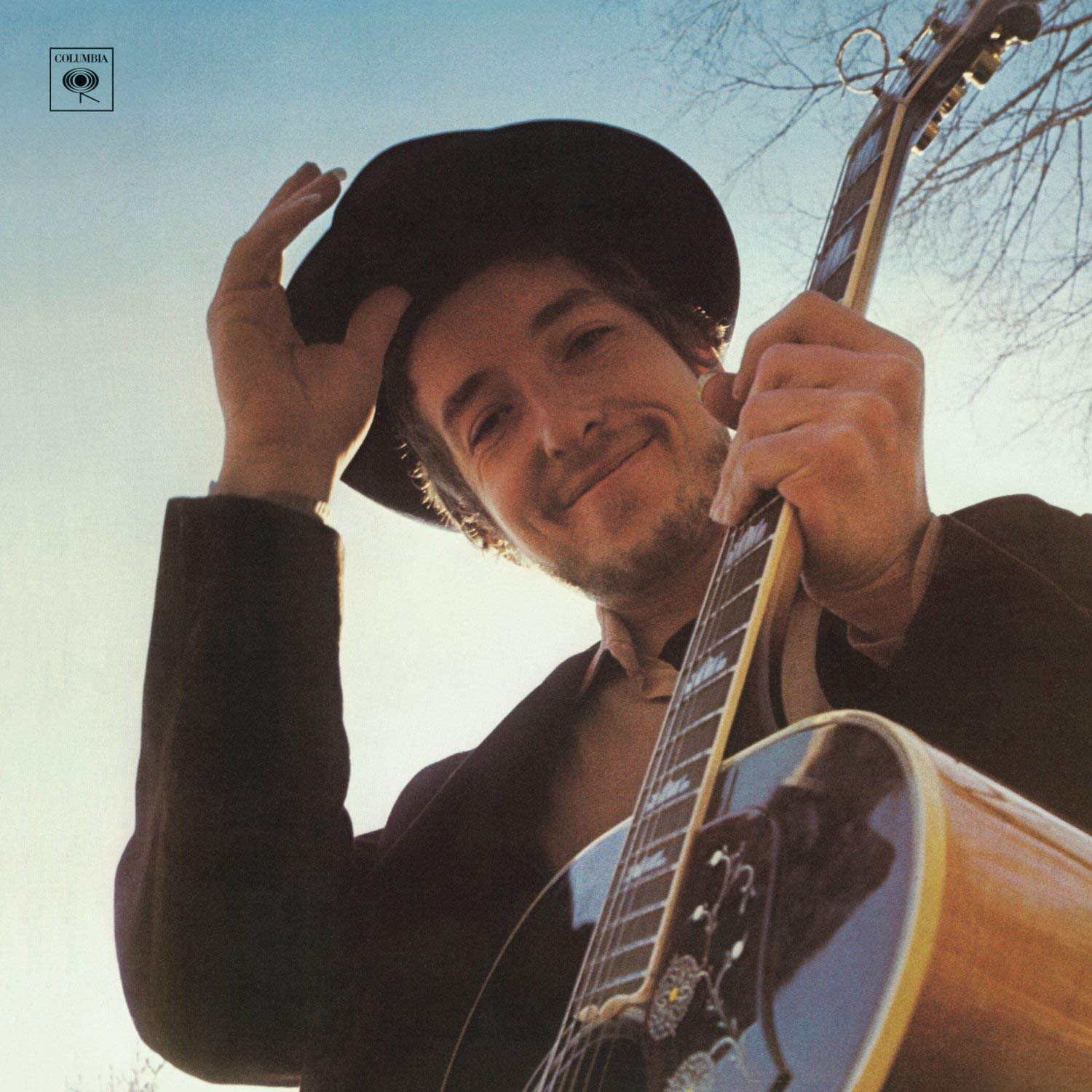
 We had chosen the best picture and I brought it down to his record label, CBS, and gave it to them. We decided that the photo would be cropped to fill the square format of the album and that there should be no writing on it—the cover would be only the photograph, with his and the album’s name on the spine and the back. The record label had nothing to do with the design, which they agreed to. However, they did add the Columbia Records logo to the top left-hand corner. And this takes away s significant part of the power of the image. If you look at the cover and then hide the logo by putting your thumb over it, it takes on a third dimension, it gains depth. When you remove your thumb, so the logo becomes visible, it loses the depth and returns to a normal flat visual experience.
Lately, I have begun to make fine art prints of that image in the square format which Bob and I selected for the album because it really is the best way to see this picture—the best way to see him as he was during that time.
When Nashville Skyline was released, now more than 50 years ago, on April 9, 1969, Landy’s image of Dylan had replaced the photo of the city that was originally intended for the cover. It’s as familiar and enduring a photo of the artist as any taken, and as synonymous with the album as such songs as “Lay Lady Lay” and “Girl From the North Country.”
If you wish to purchase a copy of this newly printed square image, please write to Elliott via his website. Click here to see his photos and for more information.
Related: Our review of Bob Dylan at 2016’s Desert Trip
Dylan’s recorded legacy is available in the U.S. here and in the U.K. here. Plenty of books on Bob are available in the U.S. here and in the U.K. here.


1 Comment so far
Jump into a conversationHey! Isn’t that AJ Weberman over by that trashcan?