The Rolling Stones’ ‘Exile on Main Street’: Behind the Cover Art
by Harvey Kubernik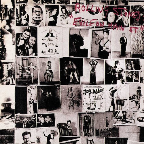 In a nearly 60-year art and music career, John Van Hamersveld has created 300 album covers, including the Rolling Stones’ Exile on Main Street, released on May 22, 1972. Van Hamersveld’s memorable 1968 Pinnacle Dance, concert posters promoting shows held at the Shrine Exposition Hall in downtown Los Angeles, had a monumental influence on pop culture designs for generations to come. Van Hamersveld’s art can be found in the Smithsonian, the Los Angeles County Museum of Art, the Museum of Modern Art, Experience Music Project and the Rock and Roll Hall of Fame.
Seek out the film documentary Crazy World Ain’t It—The Life and Times of John Van Hamersveld, directed by Christopher Sibley. The film had its world premiere at the Santa Barbara International Film Festival in 2019.
You designed the Exile on Main Street artwork. Guide us through the process of creating those visuals.
John Van Hamersveld: Most people don’t understand the politics behind the development of album covers of the past. First of all, the album was like buying a piece of pop culture fashion, constructed by a graphic designer reflecting the music culture—like Sgt. Pepper’s Lonely Hearts Club Band, or Andy Warhol’s banana for the Velvet Underground, or Pink Floyd’s Dark Side of the Moon. Then came the Exile on Main Street cover from the Stones in 1972 that turned heads.
One day [photographer] Norman Seef and I met the Rolling Stones in Hollywood. A beautiful girlfriend I had met earlier on the scene in London, Chris O’Dell, was now Mick Jagger’s personal assistant. In early 1972, the Rolling Stones approached Norman and me to work on the design of a songbook with photographs for Warner Bros. At this stage, I didn’t know that I would be packaging Exile on Main Street. The Stones were in Los Angeles at Sunset Sound studios, finishing the record. Our first meeting was set to be in Bel Air, where they were staying.
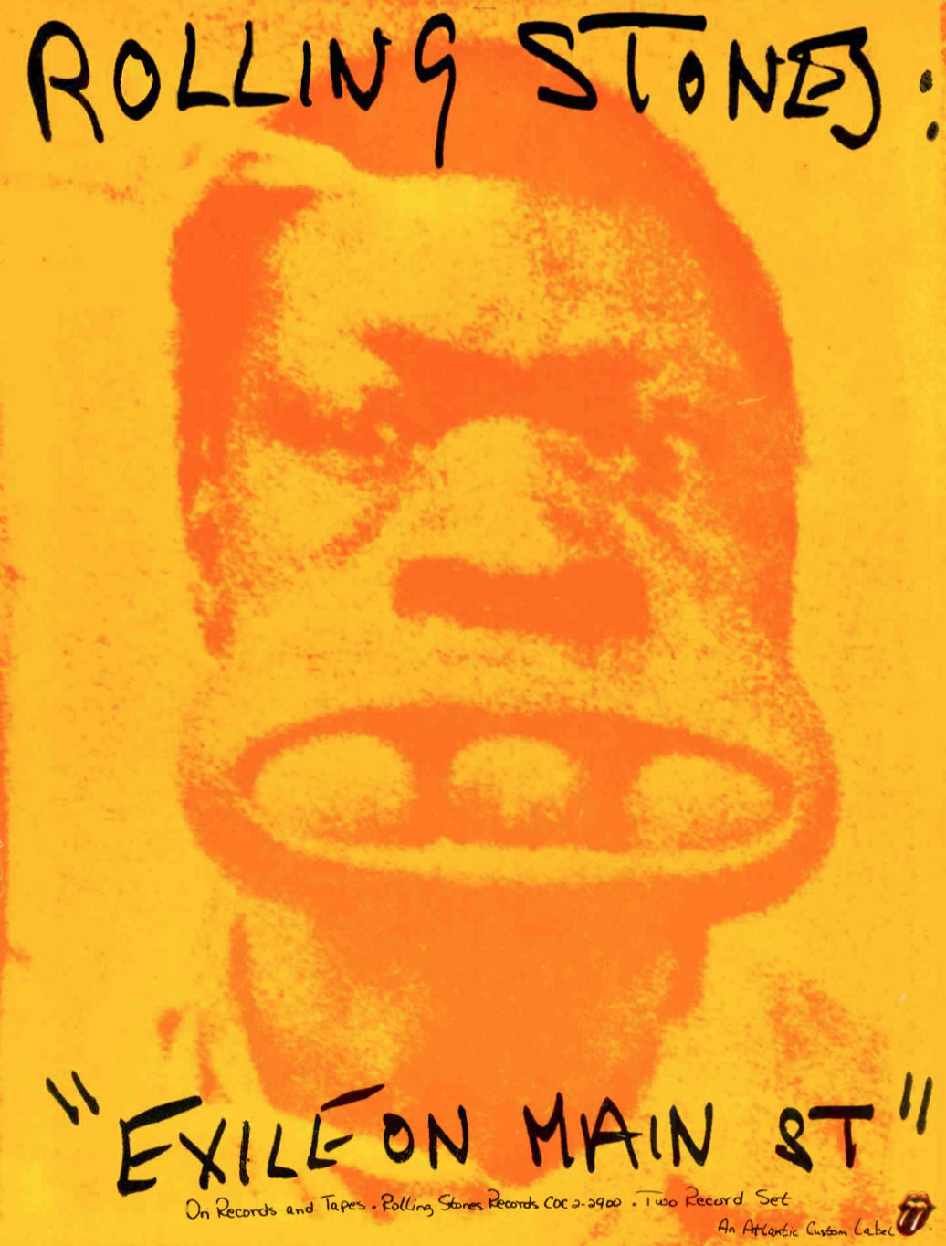
This ad appeared in the June 3, 1972 issue of Record World
Perhaps the most memorable photograph on the cover is one of a guy holding three balls in his mouth. Marshall Chess, who was then the Stones’ manager, needed an image for billboards and other advertising; I had a great idea. “Look-it,” he said, “Why don’t we take the guy with the balls in his mouth? That is the most amazing photograph I’ve ever seen. And doesn’t it look like Charlie [Watts]?”
Keith was sitting on the couch across from me. He was looking at me in his mirrored sunglasses while smoking a joint. He looked so healthy, handsome and rested. Then, to my surprise, Robert Frank [photographer and filmmaker well known for his late 1950s book The Americans] walked into the room with a small Super 8mm Canon camera. Jagger and I smiled. “This is a very hip day,” I said to myself.
Watch the Stones perform “Tumbling Dice” in 1972
I knew Robert from a meeting in New York in 1968. I knew of Frank, and said to Jagger, “Hey, why not use Frank for the album cover?” This was when the concept was launched in Jagger’s mind. Frank and Jagger had a conversation and later went off to seedy Main Street in Los Angeles to take photographs of the band, and this was when the Stones in “Exile” and “Main Street” came together as a product title.
At the request of Marshall Chess, Norman and I came to a second day of meetings. We walked through the living room of the villa, down to the far wall in the dining room where Mick and Keith were waiting with Marshall. Marshall started the meeting, and Norman handed another album cover by another designer to him. The cover was passed to Jagger for approval. He rejected it. Marshall then handed me a Robert Frank front photo collage. The tattoo-parlor-wall cover image was from Robert’s photo documentary The Americans. Mick, on my right, looked on for both of us to agree, so I nodded. This became the famous photo composition for the Exile on Main Street album cover. As the meeting progressed, the other pieces of the package were handed to me.
During the meeting, Marshall asked me what we would do with Norman’s photos, given that Frank’s photos were the agreed-upon ones for the cover. Marshall had Norman’s images from the late-night photo shoot. They were the sequences in which Keith arrived at the very last minute for the shoot. Everyone had been waiting for him to show, and then he arrived with his pants hanging off his butt. With Keith’s arrival, the group was ready to go on with Norman’s session (“This is a one-time shot!” someone said). Lights, smoke, and confetti were readied, and a sequence was attempted, but then, by accident, Keith began to fall all over the set, creating a disaster. All else failed, and our budget then had been used up.
Suddenly Keith said from across the edge of the table, “Make some postcards,” showing us with his hands an accordion-folded-style collection of postcards. He then proceeded to almost lose his balance and fall over onto the rug. I said to Mick, “Let’s take that as an idea and do it.” He agreed and Marshall said, “Done.” Marshall and Jagger handed me a stack of photos made by Frank over the weekend. I left with the visual ingredients to go to my place at the Chapman Park Studio Building.
The last step of the approval process stopped at Ahmet Ertegun’s office at Atlantic Records. He was the label’s ultimate authority, so when this kind of art and aesthetic made it past his eyes, I knew that all would be OK. In the eyes of many in the industry, they were all shocked by the ugly, rough, tough, beat look of the package and that it was not funny or real humorous (to anyone but a Johnny Rotten).
Listen to “All Down the Line” from Exile on Main Street
My arrangement of those materials would create an identity that would become the basis of the punk fashion movement.
I remember there was a huge billboard in Hollywood of your Exile imagery on Sunset Blvd. Tell us about it.
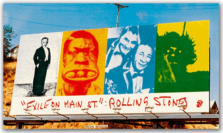
One day, Norman and I drove through Hollywood in his dark green ’69 Mustang convertible, with the top down. I had a stat of the cover in my hand, and we looked it over as an art piece. I told him I thought if I were to take four of the front cover photos out and paste them in color into the billboard composition, I would have a great design. So I later blew up the photos and pasted them on a board. The next day I had to get the right measurements for the size of the hand-painted outdoor billboards. I went over to Pacific Outdoor and there in the office we agreed, and went over the government codes and restrictions for the scale requirements. I helped them maximize the size to be larger than normal. The finished product finally was placed at Sunset and La Cienega, at the top of the hill. I focused the message around the fantasy, sideshow characters in the cover with the guy with eggs in his mouth.
This became the “freaks” displayed on the Sunset Strip, a prestigious site for the “Art & Rock Scene.” Reviewers said that the cover shot, assorted pictures of circus freaks, is not a collage but a photo Frank took in 1950 of the wall of a tattoo parlor somewhere on Route 66. The comparison to the notorious Stones—jet-setting tax exiles, cocaine-fueled satyrs and perpetual outsiders—is clear. To drive the point home, an identical layout on the back cover featured Frank’s photos of the Stones themselves, shot on L.A.’s seedy Main Street. (Frank did a 1972 tour film documentary of the Rolling Stones, the unreleased Cocksucker Blues.)
The inner sleeves were even more casually slapped together, with titles and credits hand-lettered by Jagger himself. The layout perfectly complements the sprawling, ramshackle sound of Exile itself.
Watch Keith Richards sing “Happy” on the 1972 Stones tour
Related: The stories behind all of 1972’s #1 albums
History has shown how influential your graphic style was then.
To the spectators, critics and others in the establishment, I had made a package that was not glamorous. It was not a friendly image to put on display in the record stores, but it was that image that established the anti-establishment look of punk. It took years to recover from the cover’s graphic statement, with new generations of punks exploiting the graphic concept to this day—still ripping and tearing and drawing all over things with their own graffiti.
The album cover art images from the past, as part of our culture, were styled for fashion and archetype.
In 1984, my friend John Lydon {a.k.a. Johnny Rotten] said to me, “The Stones’ Exile package set the image of punk in 1975. We used that graphic feel to communicate our message graphically.” At least Johnny was nice enough to explain what his intention was then.
In the ’70s, I do feel that 12×12 album covers were an all-inclusive image of cultural style in the visual fashion of the ’60s and the ’70s. I was, therefore, a well-known designer of cultural images which were created as reflections of that culture. These were then watched closely by other design teams and designers who copied me in their pursuit to find new images. Today, more than 100,000 artists are using a “Ripping and Tearing” style and graffiti in their work.
[A 2023 book about the Rolling Stones, All Down The Line—A People’s History of the Rolling Stones 1972 North American Tour, marks 50+ years since the landmark trek and the release of the Exile on Main Street album. The book tells the story of the tour in the words of over 300 fans. It’s available in the U.S. here and in the U.K. here.]
Watch the trailer for Crazy World Ain’t It—The Life and Times of John Van Hamersveld





2 Comments so far
Jump into a conversationWith Mick Taylor in the line-up during this time, The Rolling Stones were “The Great Rock and Roll Band.”
If this is actually THE Harvey Kubernik, thank you for all of the wonderful books. I’ve learned more from your writing over the past few decades than from most anywhere else.