 These days, when branding is everything, every band has its own logo. Creating instantly recognizable, marketable visuals is as important as choosing the best band name you can think of.
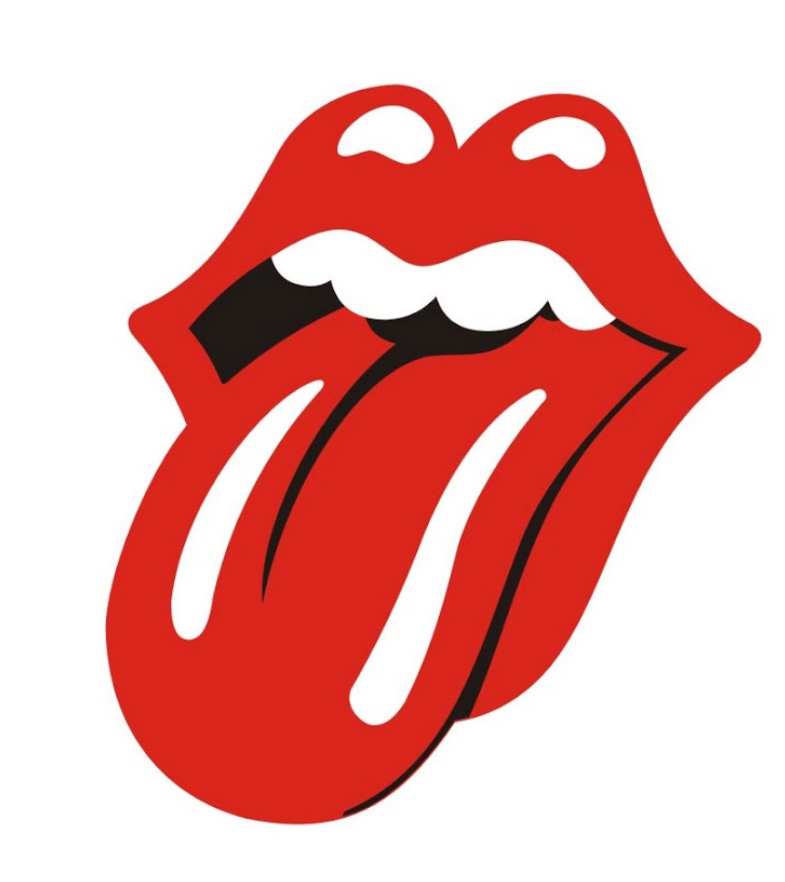
It wasn’t always that way. While the Beatles used a catchy font on Ringo’s bass drum head—the capital B rose above the other letters, the T in the middle dropped below them—and later used it on commercial products, the idea of a rock band incorporating a piece of art that didn’t involve any lettering at all was unheard of until the Rolling Stones unveiled their now-iconic tongue on March 26, 1971.
Officially called “Tongue and Lips,” but usually just the Rolling Stones’ tongue, the image was designed by artist John Pasche in 1970 after Mick Jagger approached the Royal College of Art hoping to commission images for the band’s use. Originally, the Stones wanted a striking piece of art to use on posters advertising their upcoming European tour in 1970. Pasche’s design was picked and he was given a further assignment: create something bold that the band could re-use in a multitude of ways.
The Stones’ personal assistant, Jo Bergman, sent Pasche a letter on April 19, 1970, asking him “to create a logo or symbol which may be used on note paper, as a programme cover and as a cover for the press book” for the tour. Pasche—who had previously designed posters for several British films—and Jagger met, and the artist was shown a piece of artwork depicting the Indian goddess Kali, whose tongue was sticking out in the painting. Pasche went to work and came up with the tongue and lips design, now so ubiquitous (the bright red was added later by an Atlantic Records executive).
Contrary to long-held rumors, Pasche did not base the logo on Jagger’s own famously protruding lips (although Pasche did acknowledge that said lips were quite prominent when one stared at the singer’s face close up). He told the New York Times in a April 13, 2020 interview, that the logo was intended to be a protest symbol. “It’s the kind of thing kids do when they stick their tongue out at you,” he said. That was the main reason I thought it would work well.”

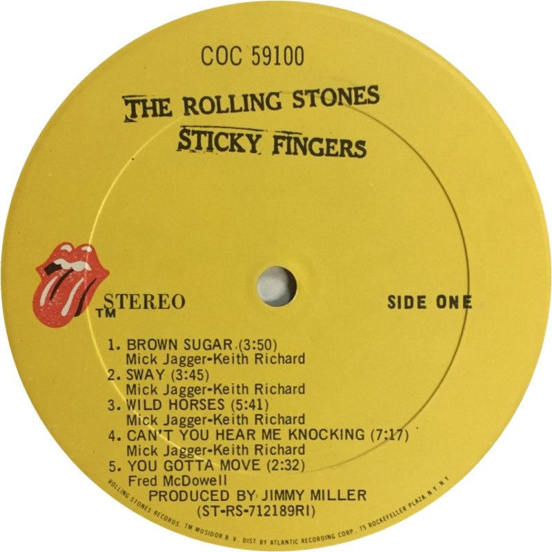
The Stones first used the tongue logo on VIP passes given out for their March 26, 1971, concert at London’s Marquee club. The image first came into view on a wide scale when the band used it on the insert inside the Sticky Fingers LP, and the record label itself, just weeks after the London show. Graphic designer Craig Braun made a slight modification to the logo. As the Times noted in its 2020 interview with Pasche, Braun “was working with Andy Warhol to realize Warhol’s idea of a working zipper on the album’s cover. Pasche said that Braun modified the design… because it had been faxed to the United States in a rush. [It] ‘was very grainy and grain’… and ‘needed redrawing.'” Braun’s elongated version continues to be the one used.
Related: Bill Wyman on the birth of the Stones
Pasche was paid roughly £50, or $75, for his efforts, plus a £200 bonus. He was granted a 10% share of net income on merchandise sales, but sold his shares to the band in 1982 for just £26,000, with no further claim to royalties. In his interview with the Times, he explained the “decision was forced by a gray area in copyright law at the time regarding usage rights — if a company had been using something for a number of years and it was recognized as part of the company, it could try to assume copyright.” His lawyer urged him to negotiate a settlement.
Pasche also created art for the Stones’ 1972 American tour and other projects for them, and worked on designs for Paul McCartney, the Who, David Bowie and others.
Born April 24, 1945, Pasche has won numerous awards for his work with rock art, and remains active as a graphic designer. The Rolling Stones’ tongue, meanwhile, has long been the most famous rock logo of all. The band’s merch, with their ubiquitous logo, is available in the U.S. here and in the U.K. here.
When the Stones announce a tour, tickets will be available here and here.
Watch an interview with Tongue & Lips designer John Pasche
On March 23, 2021, the Stones updated the profile pic of their Facebook page. The image? Their classic tongue and lips logo.


4 Comments so far
Jump into a conversationErnie Cefalu designed the Stones logo!!! C’mon get the story right
I recently read an article about the iconic symbols of rock and roll bands. In the article it talked about Pink Floyd’s symbol from their album, Dark Side of the Moon. It indicated that the light penetrated the prism to a rainbow impression of colors, was/is iconic in more ways then one. Also, the album and its symbol, have been very much listened to for many years. The music, itself, have remained at the top of the charts for many years, and still does. In addition to the great music, the symbol of the light penetrating a prism causing a rainbow coloring to be inserted on to a black plain, is itself an iconic impression. That impression also has very profound visual and mental image. An image that lasts to this very day.
The group, Pink Floyd, is more well known, I am guessing, from that image. I have been listening to them for … mumble, mumble, years. I would be willing to bet, if I did that kind of thing, that more people would know the group from that symbol than would know the songs/music. From a dead stop to a ‘GO!!!’, even I probably could not answer to the names of the song and/or the music associated with the titles. But then my brain, or what is left of it, does not function as good as it used to. LOL
With the vast number of deadheads in the world, I wonder if the Dead’s ‘Steal Your Face’ graphic may actually be “the most recognizable logo in rock”. https://en.wikipedia.org/wiki/Steal_Your_Face